Das ursprüngliche, handgebundene Buchbindebuch entstand im Rahmen der Bachelorarbeit für den Abschluss des Informationsdesign-Studiums an der FH Joanneum in Graz. Doch ich wusste schon davor, dass ich mein Wissen im Bereich Buchbinden an Interessierte weitergeben möchte. Daher beschloss ich das Buch so zu schreiben und zu gestalten, dass ich es anschließend publizieren konnte und Interessierte damit arbeiten können. Wenn du mehr über die Bücher erfahren möchtest oder Interesse an einem Kauf hast, findest du am Seitenende weiterführende Links.
Editorial Design. Illustration, Fotografie, Buchbinden
Editorial Design
Original (Bachelorarbeit) 2017-2018 | Publizierung Print 2019 | Publizierung eBook 2021
Editorial Design für Buchbindebuch
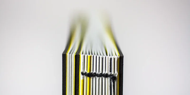
Das Buchbindebuch befasst sich mit dem Thema des DIY-Buchbindens: Wie kann ich von zuhause aus Bücher binden? Welches Material brauche ich dafür? Welche Techniken eignen sich und wie setzt man sie um?
Hintergrund zur Entstehung
Ich habe das erste Mal ein Buch in der 4. Klasse der HTL Ortwein im Rahmen meiner Ausbildung zur Grafik und Kommunikationsdesignerin gebunden und war sofort Feuer und Flamme. Als Schülerin ist das Budget natürlich begrenzt und habe mich anschließend im Selbststudium mithilfe des Internets und Bücher weitergebildet. Während meines Austauschsemesters an der FH Potsdam in Deutschland besuchte ich meinen ersten Buchbinde-Kurs und lernte dort, worauf es beim professionellen Buchbinden ankommt. Zum Abschluss des Kurses mussten wir eine Dokumentation des Gelernten anfertigen und ich tat dies in Buchform. Das kleine Büchlein trug damals den Namen „Buchbindebuch“ und somit war die Idee geboren, nicht nur das Wissen aus dem Kurs festzuhalten, sondern auch mein gesammeltes Wissen aus dem DIY-Bereich, vereint mit dem Wissen der professionellen Buchbinderei. Der Plan war, das Buch so zu schreiben, dass sowohl Anfänger als auch Fortgeschrittene mit dem Buch arbeiten konnten. Nach einem 3monatigen Praktikum in der Handbuchbinderei Mohringer-Kober im Schloss Freiberg setzte ich diese Idee im Rahmen der Bachelorarbeit um.
Editorial Design Details
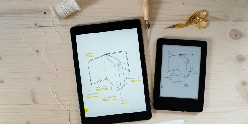
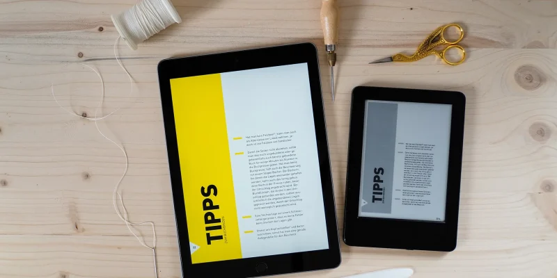
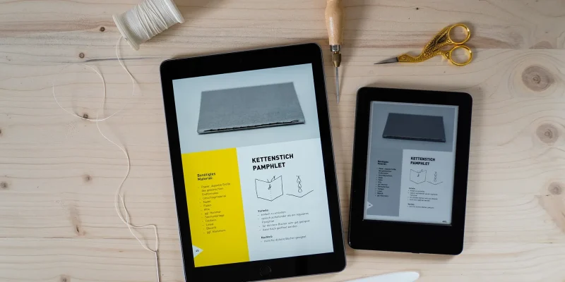
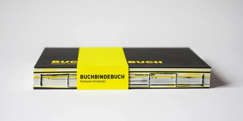
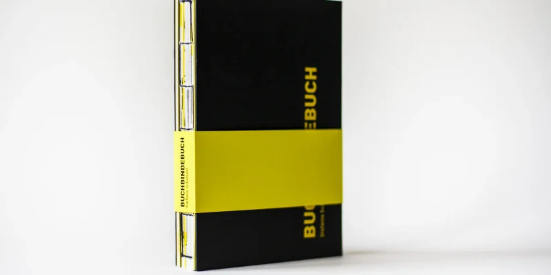
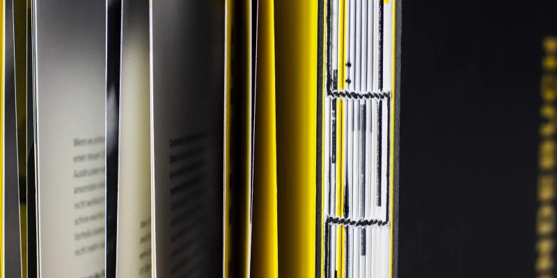
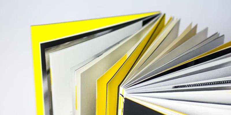
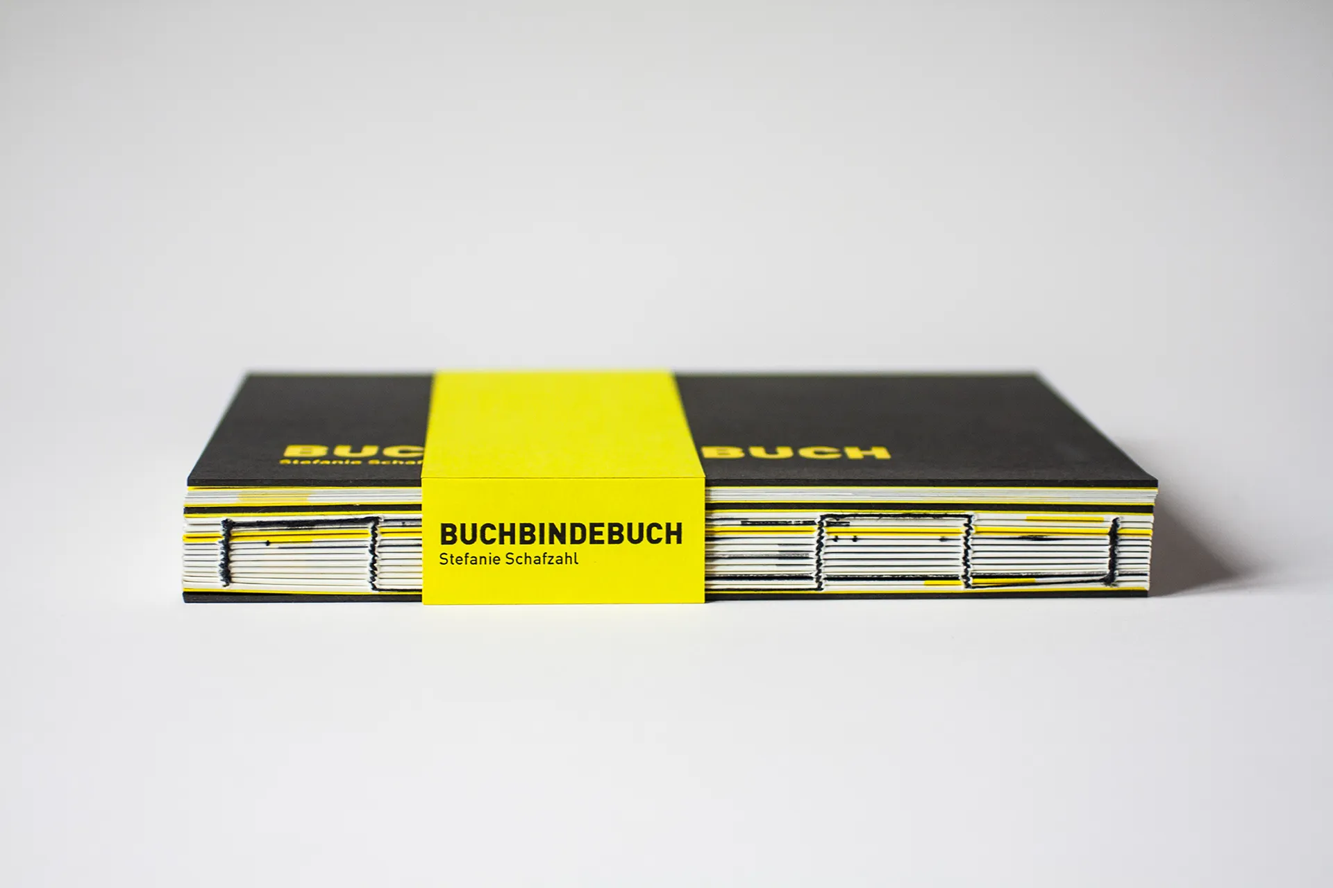
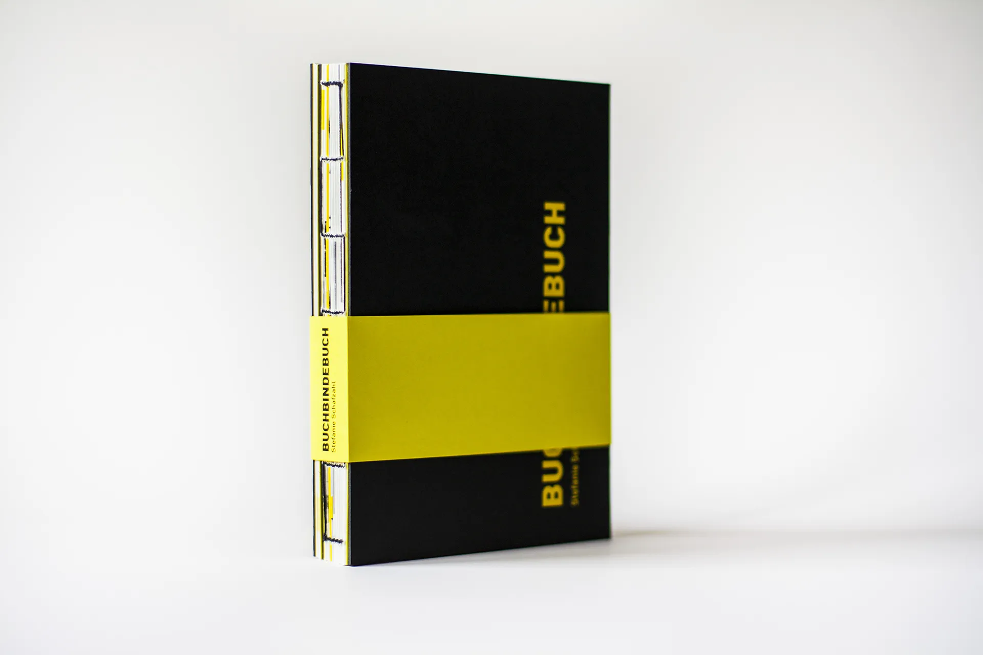
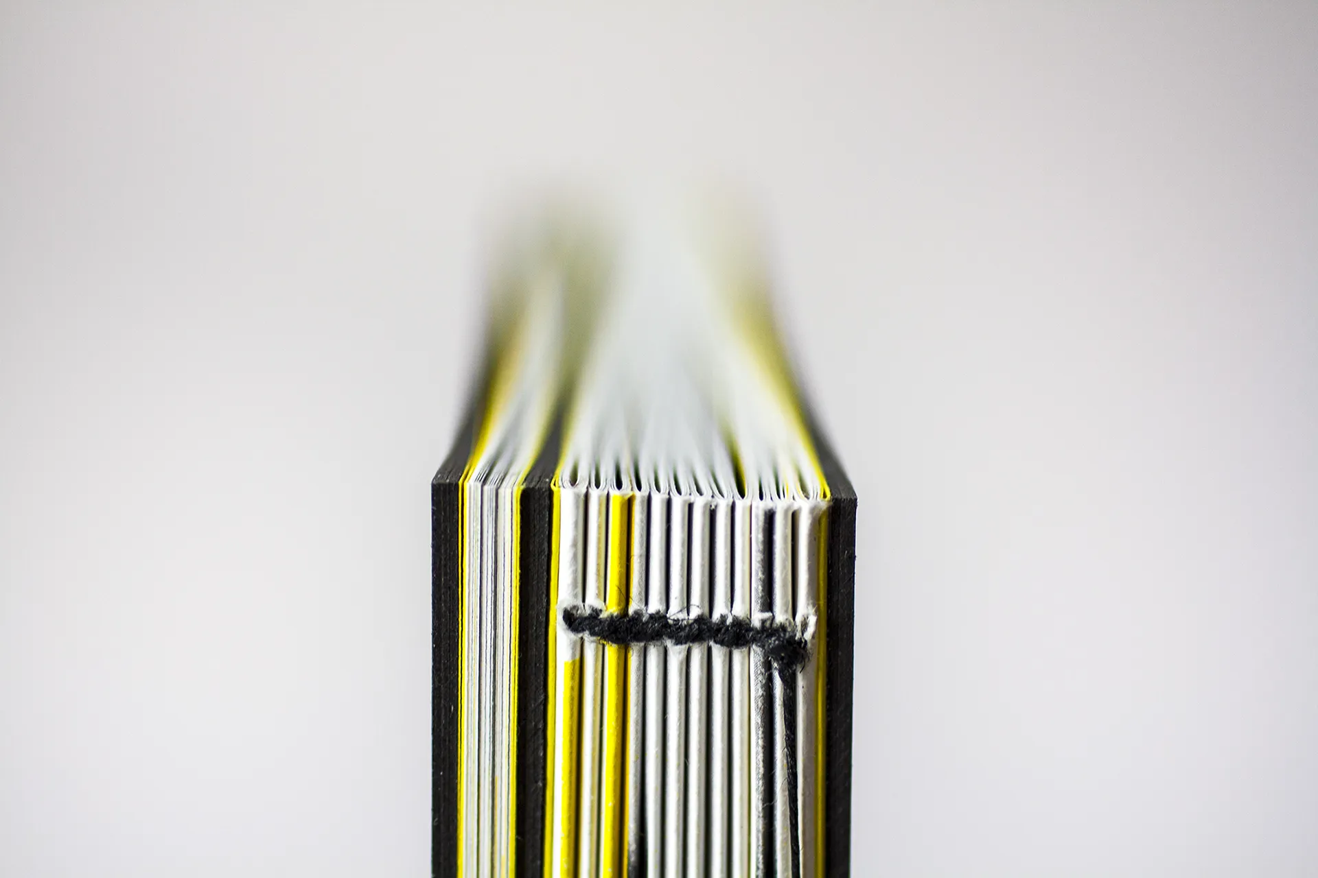
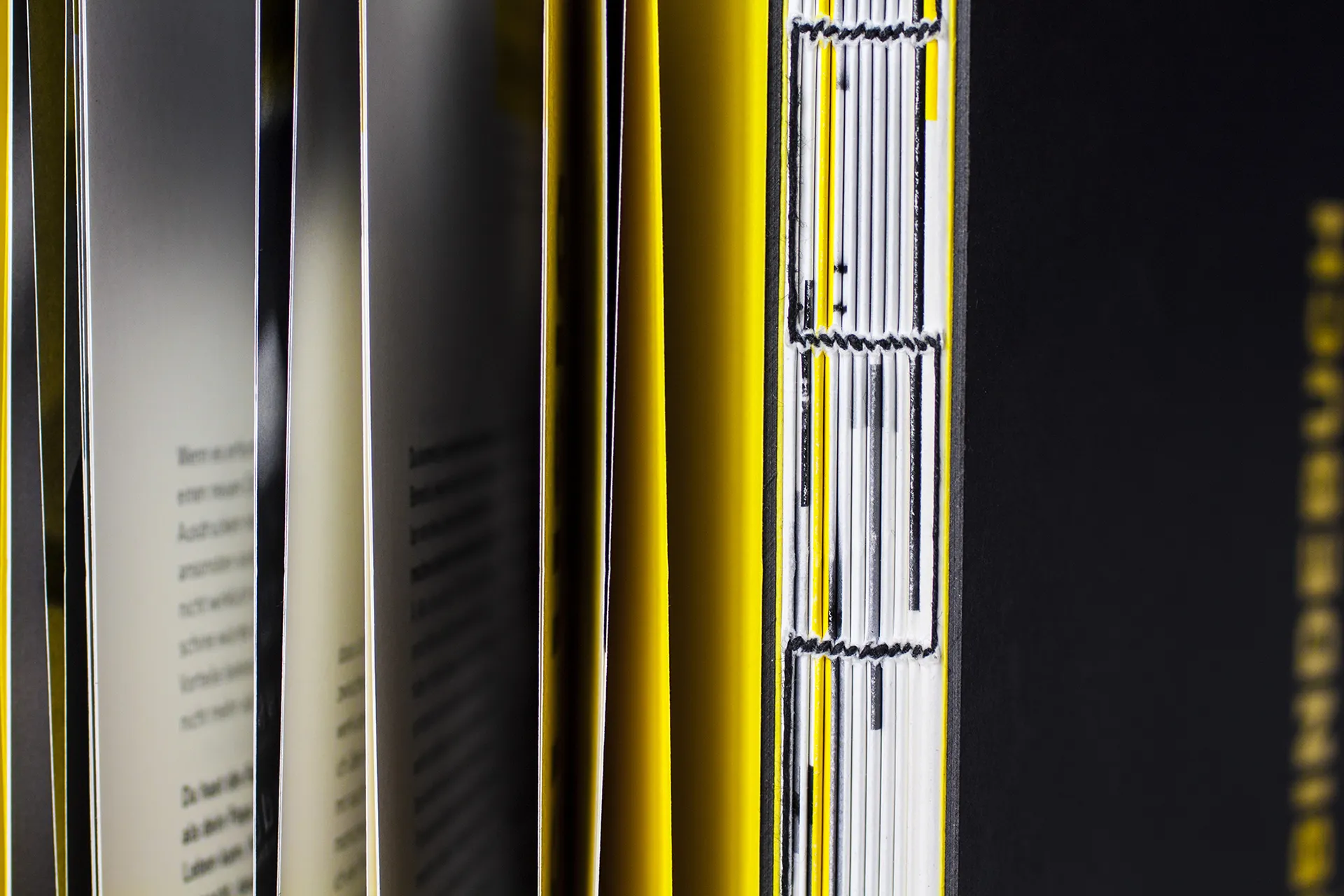
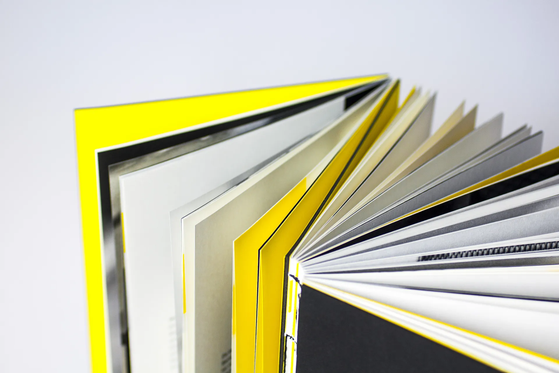
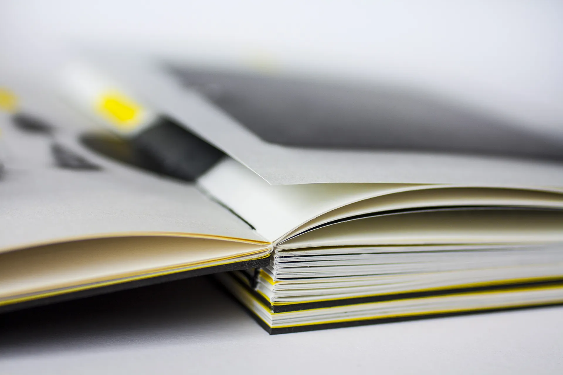
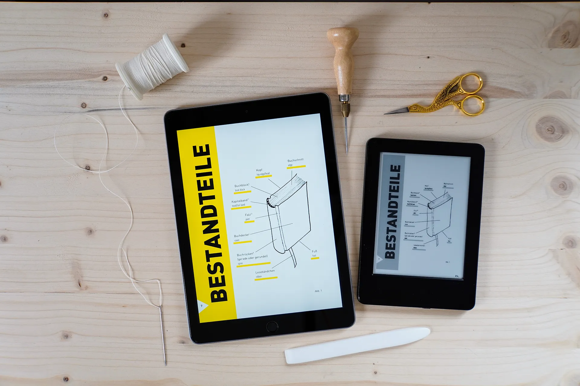
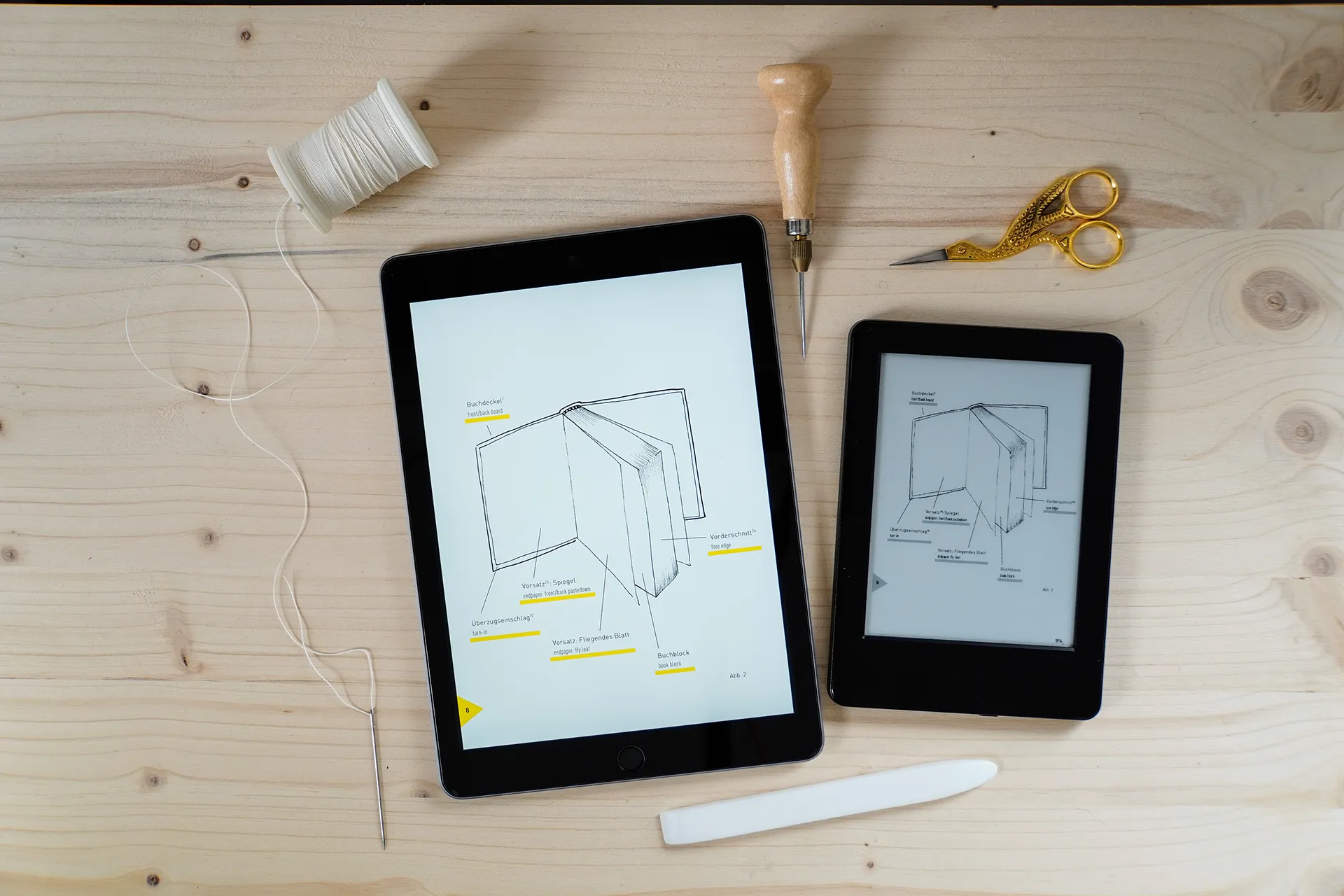
Die Farbwahl umfasst Schwarz, Weiß und nur eine Farbe, nämlich Gelb. Der Grund dafür ist, dass es auch auf einem eReader funktionieren sollte, der nur Schwarz und Weiß anzeigt. Dank der Reinheit des Gelbs ist seine Intensität genauso stark wie bei einem gedruckten Spot-Farbton, wie zum Beispiel Pantone, verwendet jedoch trotzdem CMYK.
Die Schriftauswahl ist Interstate, eine moderne, saubere, leicht lesbare Schrift, die sowohl im Druck als auch digital gut funktioniert. Ihr Charakter unterstützt das klare Design und umgekehrt.
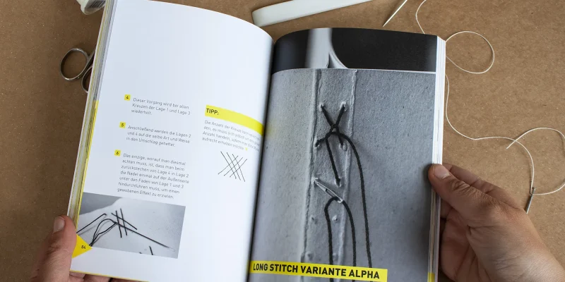
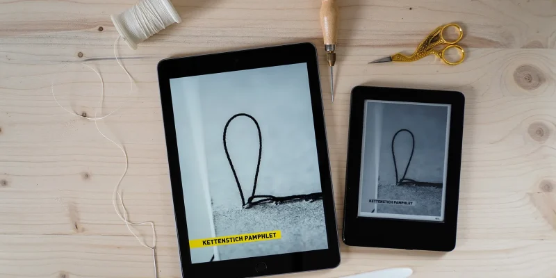
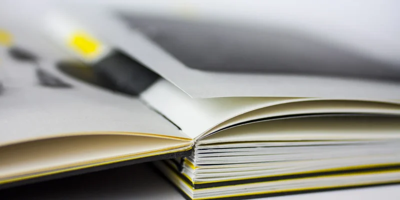
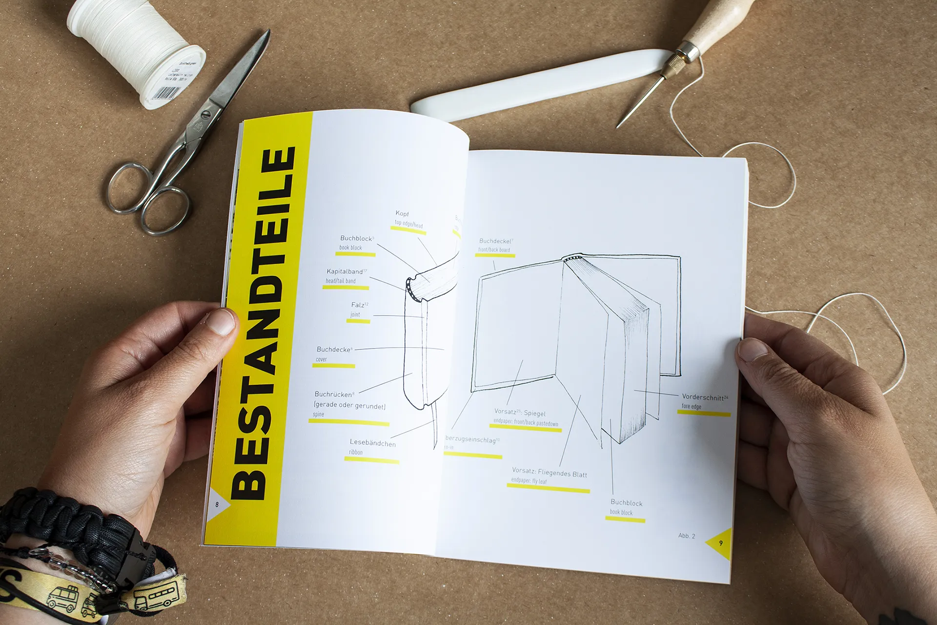
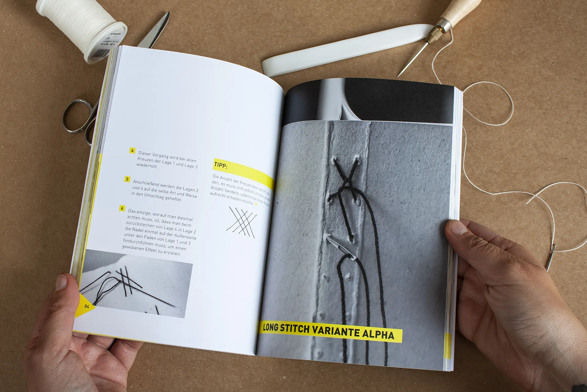
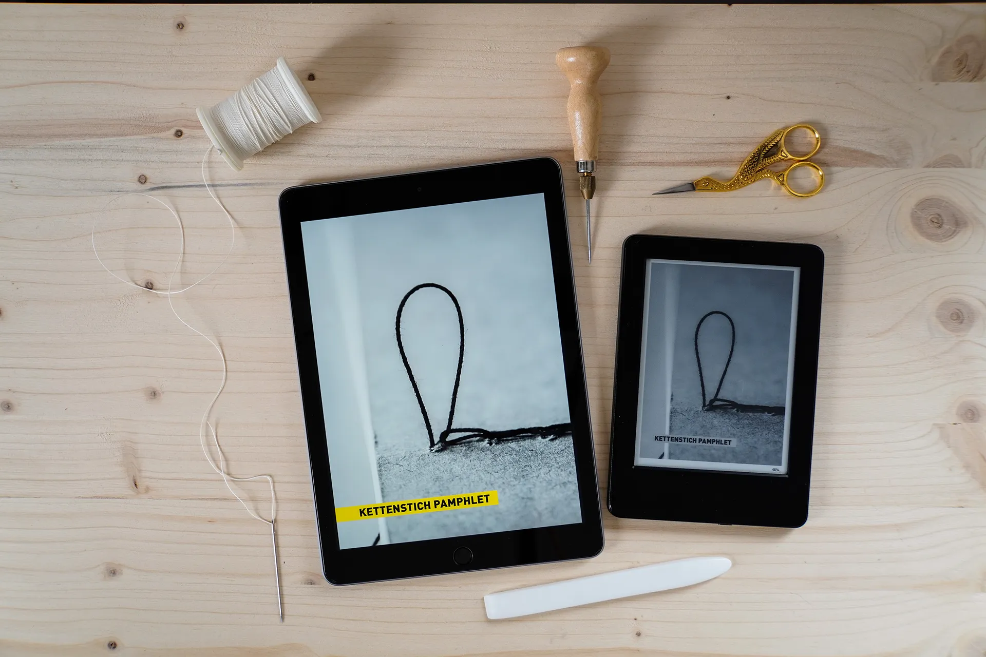
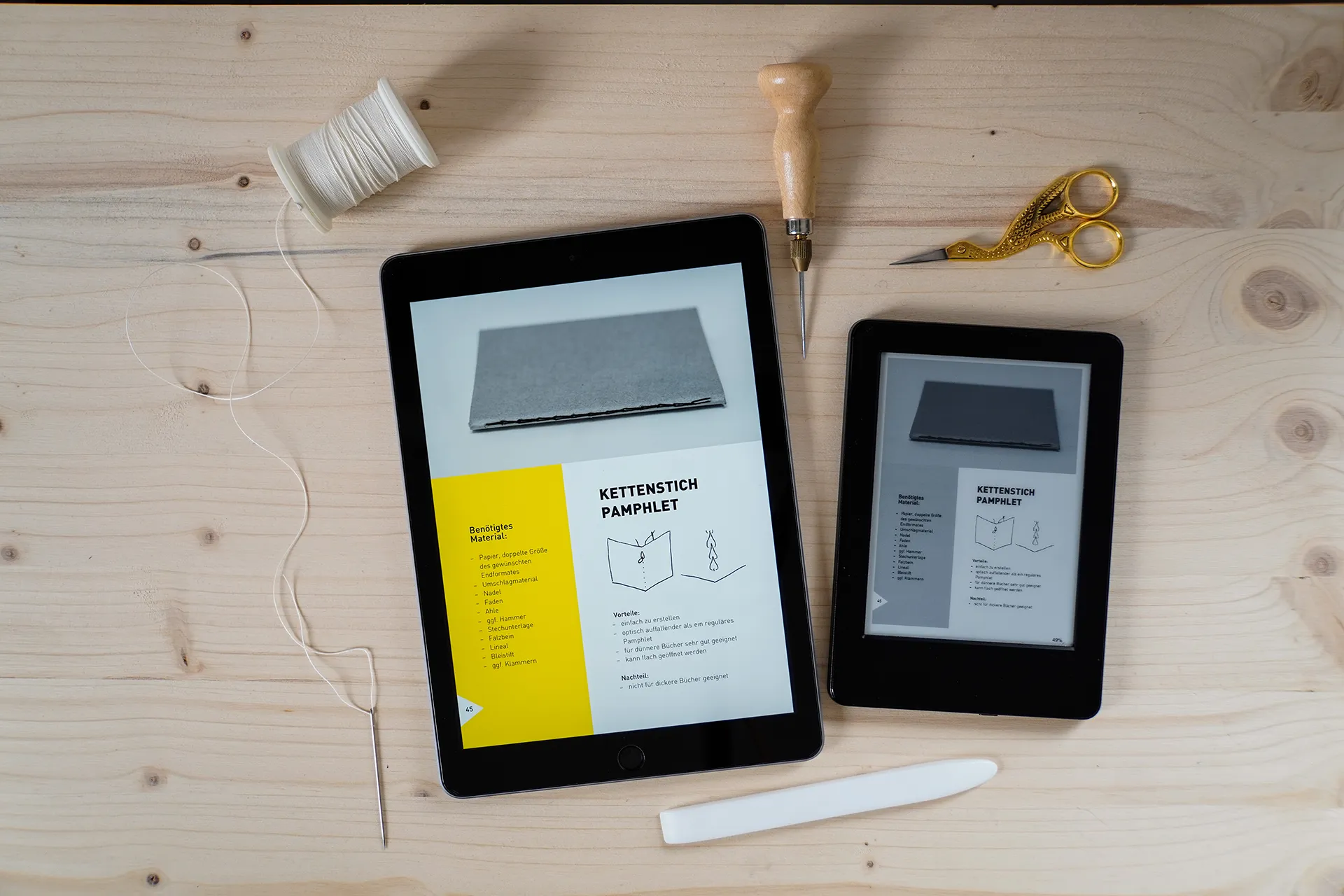
Die Fotos wurden in einer Buchbinderei und zu Hause beim Binden der Bücher für die Anleitungen aufgenommen. Sie dienen als zusätzliche Erklärung zu den Textanweisungen, helfen jedoch auch, die Atmosphäre einer Buchbinderei und handgebundener Bücher zu vermitteln.
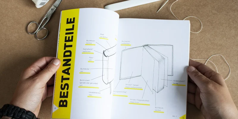
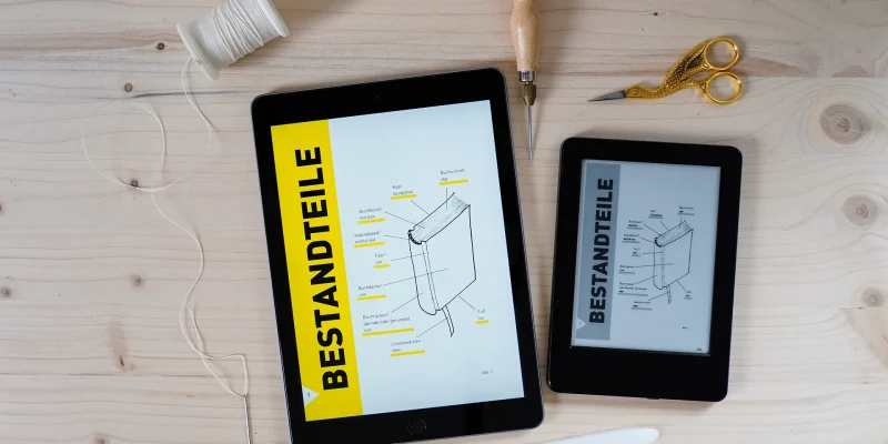
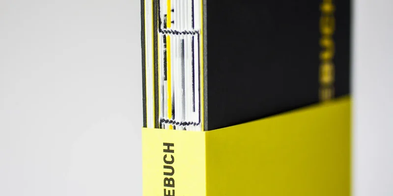
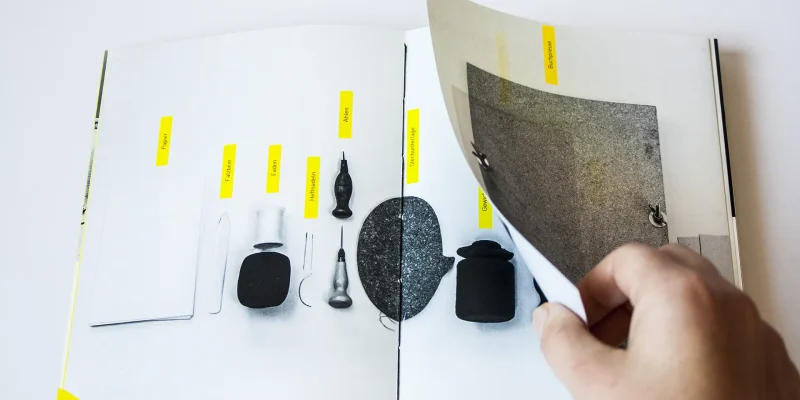
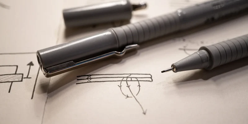
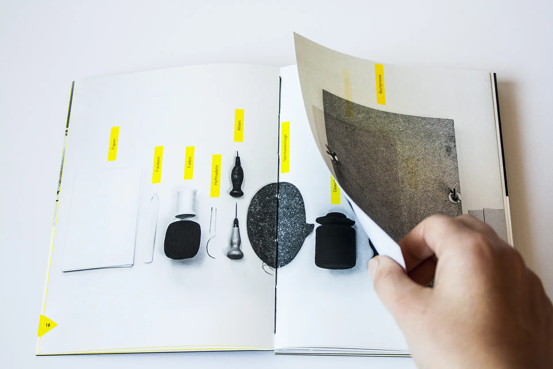
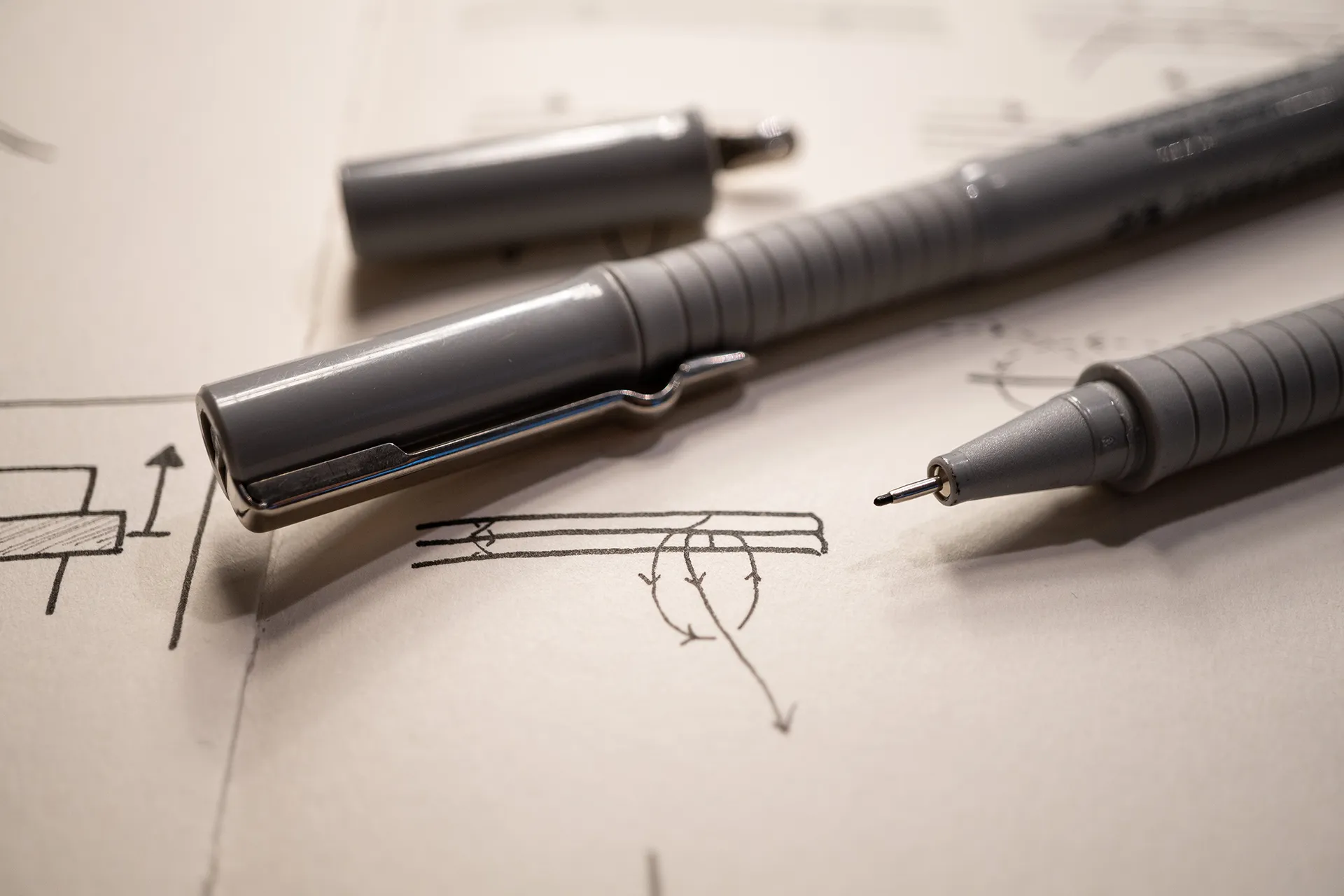
Die Illustrationen wurden von Hand gezeichnet und gescannt. Es wurde kein Lineal verwendet, um die natürlichen Unvollkommenheiten gerader Linien zu bewahren, was das DIY-Gefühl unterstützt.
Die Größe wurde auf mehreren Fakten basiert:
- die maximale Druckgröße der Druckerei, bei der zwei Doppelseiten auf ein Blatt Papier passen konnten, um unnötigen Papierabfall zu vermeiden
- die Vorliebe für ungefähr A5, aber das Verhältnis sollte breiter sein
- die Möglichkeit, eine ausklappbare Seite mit insgesamt 3 Seiten zu erstellen, die immer noch auf der maximalen Druckgröße druckbar ist
- es sollte dem Verhältnis eines eReaders und Tablets ähnlich sein, damit es auch gut als eBook funktioniert
Das Editorial Design, die Illustrationen, Fotografien, Texte und Anleitungen wurden von Stefanie Schafzahl | Corliss geschrieben und erstellt.
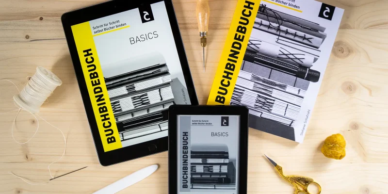
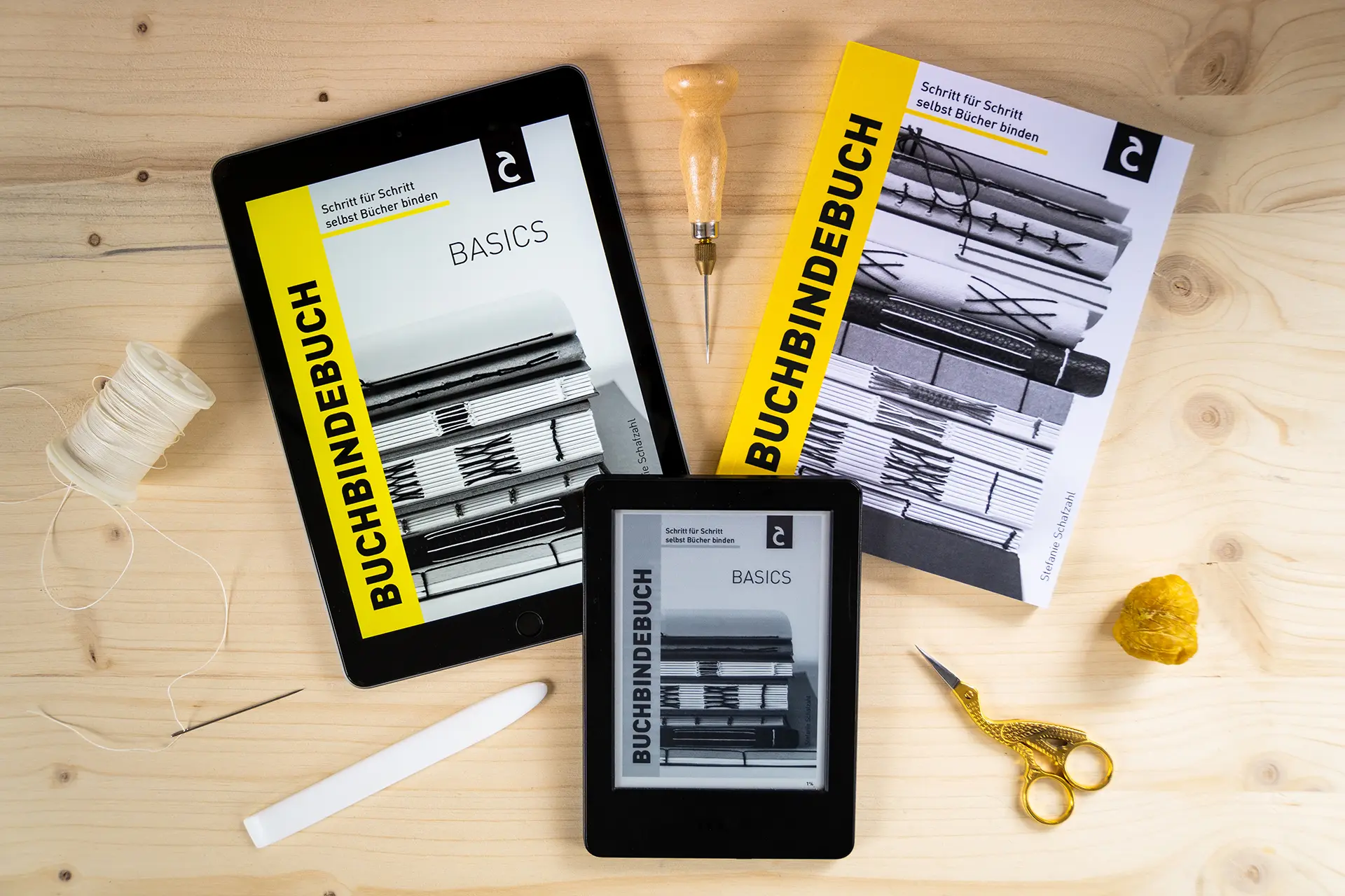
Buchbindebuch Basics (eBook)
Das eBook ist ein Auszug der Print-Vollversion. Es umfasst das wichtigste theoretische Wissen und viele bebilderte Schritt-für-Schritt-Buchbinde-Anleitungen, um zu starten. Perfekt, wenn du neu oder noch sehr unerfahren im Bereich des Buchbindens bist und es erst einmal ausprobieren möchtest, ohne schon viel Geld zu investieren. Dann ist dieses eBook genau richtig für dich!
Wichtige Info: Das Buch ist selbst publiziert und nur auf Amazon erhältlich.
*Affiliate Link: Wenn du über diesen Link kaufst bekomme ich eine winzige Provision von Amazon. Du bezahlst deswegen keinen Cent mehr und ich freu mich über deine Unterstützung.
Buchbindebuch (Print)
Bei der Printvariante handelt es sich um die Vollversion. Es umfasst das wichtigste theoretische Wissen und viele bebilderte Schritt-für-Schritt-Buchbinde-Anleitungen. Egal, ob du erst mit dem Buchbinden anfängst oder schon fortgeschritten bist: Es ist perfekt zum Starten, aber auch um neue Techniken auszuprobieren, wenn du schon Erfahrung hast. Dieses Buch wird zu deinem treuen Nachschlagewerk, wenn es um Bindetechniken geht.
Wichtige Info: Das Buch ist selbst publiziert und nur auf Amazon erhältlich.
*Affiliate Link: Wenn du über diesen Link kaufst bekomme ich eine winzige Provision von Amazon. Du bezahlst deswegen keinen Cent mehr und ich freu mich über deine Unterstützung.