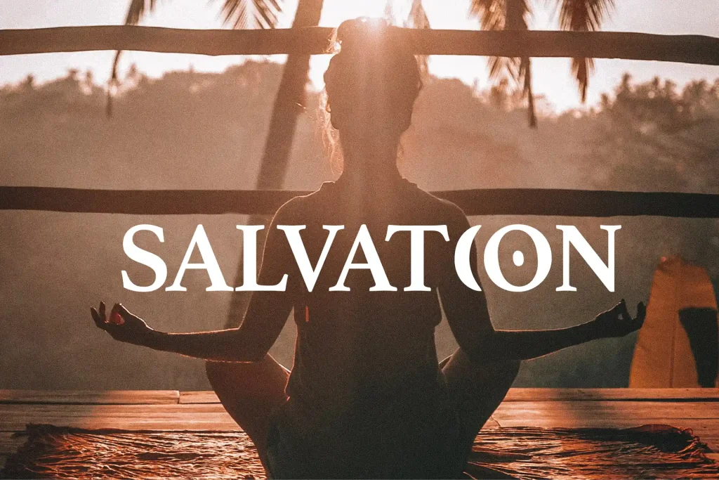
Wir sprachen über ihre Vision, ihre Werte und alle anderen wichtigen Teile, die für ein gutes Logo unerlässlich sind. Eszter bietet derzeit traditionelles und ganzheitliches Yoga sowie Meditation an. Nicht nur für Menschen, die mehr Zentrierung und Stärke suchen, sondern auch für diejenigen, die das Gefühl haben, nicht flexibel genug zu sein, Gelenkveranlagungen und andere körperliche Einschränkungen haben. In Zukunft möchte Eszter auch astrologische Unterstützung anbieten und hat eine große Vision für die kommenden Jahre, die wir bei der Erstellung berücksichtigt haben.
Logo Kreation
Brand Design
2022
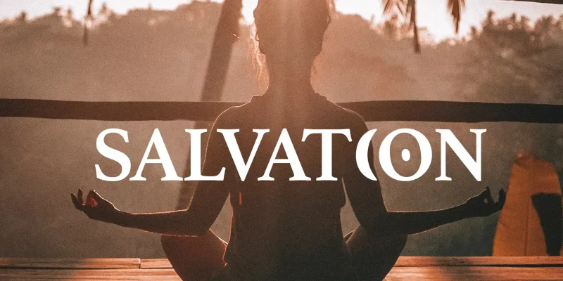
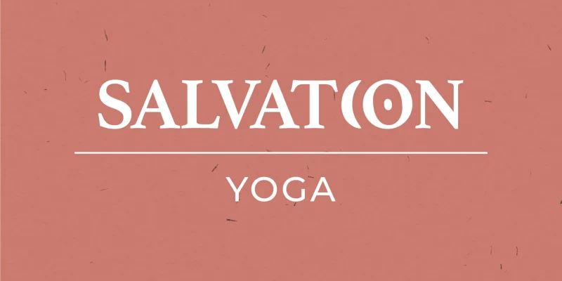
Brand Design für
Salvation Yoga
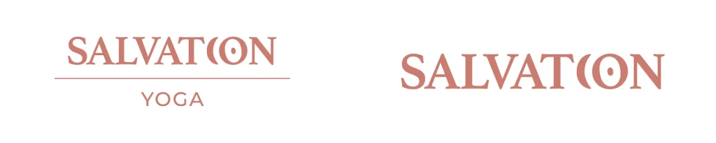
Zuerst probierten wir verschiedene Ideen mit Negativraum und Asanas aus, aber sie waren zu komplex für ein Logo. Dann wechselten wir zu Symbolen, die nicht nur Teil der Astrologie, sondern auch des Yoga sind: die Sonne und der Mond.
Wir alle haben beide Teile in uns und das Ziel von Hatha ist es, sie zu vereinen:
- Auf der linken Seite ist es der Mond, Yin, passiv, kalt, parasympathisches Nervensystem, Entspannung, „weiblich“.
- Auf der rechten Seite ist es die Sonne, Yang, aktiv, warm, sympathisches Nervensystem, Spannung, „männlich“.
Wir brauchen beide Seiten, um zentriert und ausgeglichen zu sein. Und wenn du im Gleichgewicht bist, folgt die Hingabe.
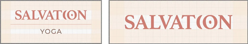
Die Farben sind warm, erdig und einladend. Die Schriftauswahl ist zeitlos, sowohl modern als auch traditionell, jedoch alles andere als langweilig. Dies ermöglicht Eszter, ein breiteres Publikum anzusprechen, das wieder eine bessere Verbindung zu sich selbst herstellen und etwas Gutes für Körper und Geist tun möchte.

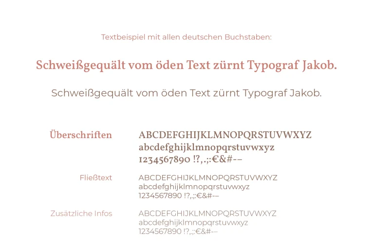
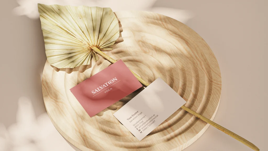
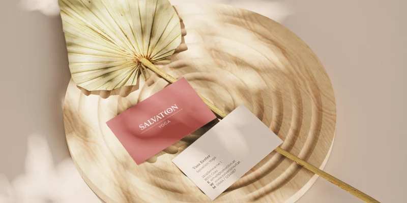
Eszter ist nun mit einem umfangreichen Ordner mit wesentlichen Logo-Formaten ausgestattet, sowohl für die digitale als auch die gedruckte Verwendung. Dies ist für die nächsten Schritte unerlässlich. Das Projekt wird durch einen praktischen Style Guide abgerundet, der Eszter dabei unterstützt, in ihrem Brand Identity Design konsistent zu bleiben. Er enthält Informationen zu den Logo-Größen, Abständen zum Logo, um ihm Raum zu geben und ordnungsgemäß zu funktionieren, sowie den verschiedenen Codes ihrer Markenfarben und Schriftschnitte. Ein hochwertiges Brand Identity Design kann nur funktionieren, wenn es konsequent umgesetzt wird.
Sie hat eine große Vision, und ich freue mich sehr, sie auf der Designseite dabei zu unterstützen, diesen erstaunlichen Traum in die Realität umzusetzen.