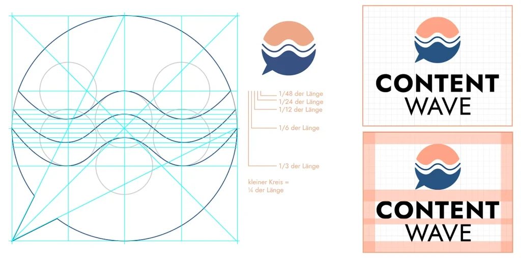
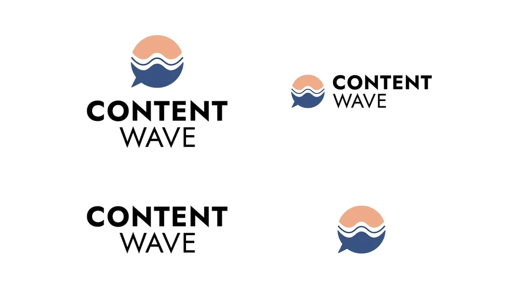
skip to Main Content


Brand Identity Design for CONTENT WAVE

The logo for Ilka’s brand CONTENT WAVE was created in a different way than usual.

Several reasons made me consider testing out a different format of how I create a logo. Normally, I would make logo drafts based on the information I collected from the client in advance. Then I would present the drafts to the client and get their feedback. The feedback gets incorporated to make sure the client is happy with the design. Usually, it takes two correction loops until the design is finished.

This time I created the logo together with the client in a sort of workshop setting. After going through the workbook, we brainstormed how her name could be visualized and what “content” actually is. We tried out different things and gave each other food for thought until it suddenly all came together:

The top is a recumbent c, the bottom is the w. But it’s not only the initial letters of the brand name, which are combined in a speech bubble, it’s also a sunset over the sea, conveying freedom, action, irresistible change, and moving things forward. This is what Ilka’s service enables her clients.

Logomark Grid and Logo Setup Grid of Content Wave - by Corliss Design

Therefore the symbol doesn’t only communicate the name of the brand and that content is about communicating ideas, it also symbolizes Ilka’s values and passions freedom, location independence, and self-fulfillment. This is what makes professional Brand Identity Design is so much more powerful than just creating a “pretty symbol” and saying that’s your logo.

The color and font choices stand for Ilka’s structured style of working and enabling human connection through content, as well as freedom and action.

The color world of Content Wave: night blue, coral, chai latte and ice blue - by Corliss Design

The corporate font of Content Wave - Brand Identity Design by Corliss Design

Ilka is now equipped with a big folder of essential logo formats, whether that’s for digital or print use. The project is topped off with a handy style guide, which supports Ilka to stay consistent in her brand identity design. It includes information about the logo sizes, distances to keep to the logo in order to let it breathe and work properly, as well as the various codes of her brand colors and font cuts. Because a high-quality brand identity design can only work if it’s implemented in a consistent way.


2022, project for Content Wave (under development)

Back To Top